RED: Red is the colour of blood, love and fire. This is the reason everyone associate it with war, fear, energy, love, passion and power. It's an emotionally intense colour and it is proven that it can stimulate a faster breathing and a faster heartbeat.
ORANGE: People think is a combination of red and yellow. Yes it is! Red gives you energy and yellow happiness. Orange can give you both. Also represents sunshine, joy, creativity and success. Orange has very high visibility and is very important to know if you are a designer.
YELLOW: Yellow can be described as the colour of the sun, energy, happiness and also is a warming effect.
GREEN: if you would give a colour name to the smell, this could be green. The reason is because green symbolizes nature. It is very calming and refreshing colour to the eye.
BLUE: Blue is the colour of the ocean, water and sky. Also blue can refer to cold, fear or even death. Also blue can show loyalty and is a reason why many uniforms are in shades of blue.
PURPLE: Purple is the colour of royalty, wealth, money, and luxury. And also can be the colour of romance and girlish act.
Companies that own colour:
- Ferrari, Vodafone, Red Bull, Coca Cola, KFC
- Orange, TNT, KTM
- DHL, Shell, Kodak
- BP, Animal Planet, Jaguar, Rolex, Starbucks
- Intel, Ford, IBM, Philips, Facebook
- Cadbury, AVID
Exercise 1: Write a brief report on how to source images and copyright:
I searched on www.istockphoto.com and on www.imagesource.com to investigate how you can buy different pictures and images that you may want to use them for design proposes. Those two sites differ in the process of how you can buy an image. istockphoto is working with credits. The more the picture's resolution the more the credits. Also there is a difference from photographer to photographer. The rating allows you to earn more credits for your image. On the other side now the imagesource web page has standard prices to buy a photograph. Again the biggest the resolution, more the price. Overall both sites are really good image web pages for source images and its appropriate for any good photographer to post their photographs.
Exercise 2: Locate 2 interesting colour case studies.
Theorise as to why those colour choices were made.
How brands "own" colour.

Exercise 3: Locate 2 or more designs that incorporate photography and analyse them:

1.This is a very clever advert for AIDS. The image add depth to the advert by putting many hands on the woman's body. It gives you the message that you have to use protection because you don't know the past of that person.

2.Another good example of AIDS advert. The scorpion symbolizes the woman, which is having an affair with the man on top. It also gives the message that if you don't use any protection, this woman will give you a painful death.

3.Very clever advert by the BBC channel. The choice of the photograph the chose makes it event better. The 3D trick they used makes the message even clearer with their slogan. When I first saw this advert, I was really impressed by this result.
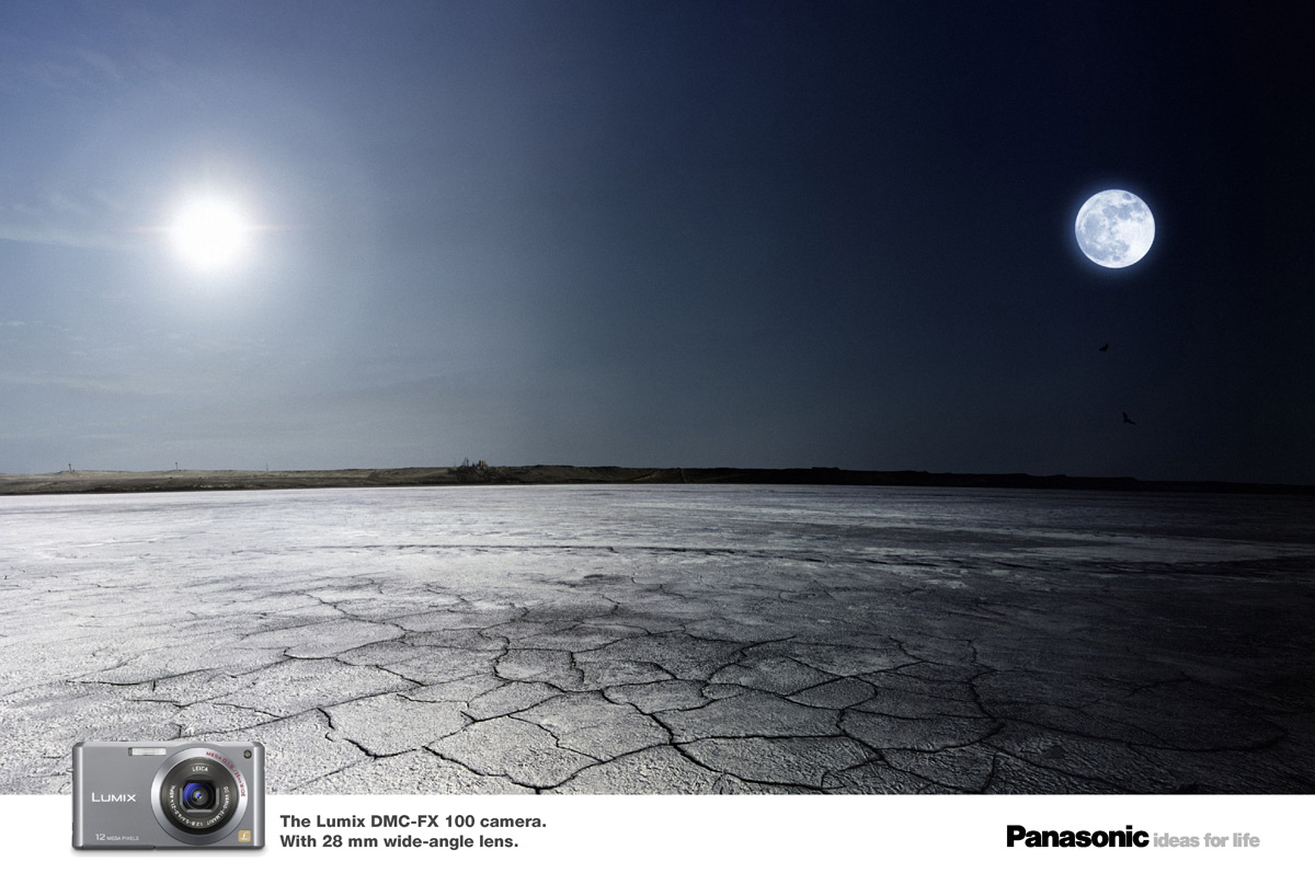
4.An advert for Panasonic and a very good one! They promote their new digital camera with the title wide-angle. The choice of the image they used couldn't have been better.

5.Another good advert from Panasonic! The slogan they have used to the image they used is very clever and professional. "With intelligent face detector"
References: http://www.smashingtips.com/35-creative-ads-that-makes-you-look-twice
http://pinewooddesign.co.uk/2009/04/14/spider-sex-shocking-condom-adverts/
No comments:
Post a Comment