Individually, brainstorm a logo and business card design
Create a logo (you can use Illustrator if you wish), and layout a card in InDesign
Remember: business cards are 85mm x 55mm
Business Card Brief
for “Bright Ideas Design” again
They are a young, funky company, and would like the business card to reflect that image
This time- both type and shape!
Logo for Bright Ideas:

For my "Bright Ideas" logo I wanted to be something that contains colour and creativity together. Instead of the letter I, I used a lamp in its place. The reason to that was, because all people are related from a young age, through cartoons and adverts with a lamp as an idea. When I made the lamp, I wanted the rest of the logo to be simple and bright. I think its a catchy idea and its appropriate to young people, which is the company's goal.


Business Card (Front):


Business Card (Back):
 The back site of my business card is white because it makes really good contrast to the front of my business card. The structure of it is exactly the same. Only the background colour is different. Also I wrote my contact details on a light lilac colour, which is almost the same as the circle that is closer to my details.

Find 3 interesting logo case studies and analyse them:
 This is the logo of Armani's clothes. I not a really big fan of clothing, but I have to admit that this is a very clever logo idea.
Many people could say that this logo is really simple and anyone could have done it. The only thing that i am sure about is that if you are not a good designer you will never come with this idea into your mind. Logos have to be as simple as they can. In this case the designer chose the most elegant fonts that he could find around. With really thin lines and in contrast to big black lines. Even if you see it in the road for example, it shines and you understand immediately that this is a serious big clothe company. Also black means, is appropriate to old business man or even in general wealthy people that can afford to buy this kind of clothes.
 Now I have chosen this opposite clothing line called PRIMARK. Only from the picture you can realise that it sells cheap clothes but with value, and it refers to all working classes. Its logo shows no standards require to buy clothes from our shop. But from the other hand I could say that this logo could be improved. The blue colour of the logo doesn't fit in at all. Furthermore they is space for improvement on the type of font they used.
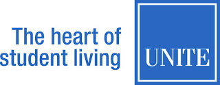 Third and last logo case study is the UNITE's logo. Unite is one of the biggest companies in United Kingdom for private student accommodations. I cannot really say that this logo is an example of a good one. Yes, the slogan they are using is a clever one. Furthermore I can find anything else good on that logo. First of all the colour reminds me a big financial company, and not something appropriate for students living in. Also the type of fonts the used are inappropriate for this kind of company.They should have used 2 or 3 colours in it with more creativity and also the fonts should be in sons serif which they will show that is a modern company, appropriate for modern student to live in.


Find 3 interesting logo case studies and analyse them:
Many people could say that this logo is really simple and anyone could have done it. The only thing that i am sure about is that if you are not a good designer you will never come with this idea into your mind. Logos have to be as simple as they can. In this case the designer chose the most elegant fonts that he could find around. With really thin lines and in contrast to big black lines. Even if you see it in the road for example, it shines and you understand immediately that this is a serious big clothe company. Also black means, is appropriate to old business man or even in general wealthy people that can afford to buy this kind of clothes.

like the idea and all the info...thanks you share it with us as i need these ideas to design plastic business cards.
ReplyDelete